
Introduction:
Recently, I was working on my Twiter bot (https://twitter.com/WittyHumorBot) completely written in Powershell, but part automating multiple jobs that run continuously on my screen, I managed to write a script to set all PowerShell consoles automatically in a grid layout like in the below image

But I was not able to do that with taskmgr.exe in order to monitor performance bottlenecks and which was not at all customizable to my needs.
Features and Script:
So I decided to write a function that is customizable and can display a graph in a Powershell console which can also be set in an Automated grid layout (I’ll share the grid layout script in a later blog post).
Also,
- I want to Color-code the output depending upon the Value of the Datapoint; Above/below some predefined thresholds
- Display custom information on X and Y-Axis labels
- A Graph in the console that is independent and fully customizable, not like Task Manager’s (no need to switch to Performance Tab) and,
- which could be easily used in any Powershell script to monitor performance on any defined parameter, which I see as the biggest benefit of the function.
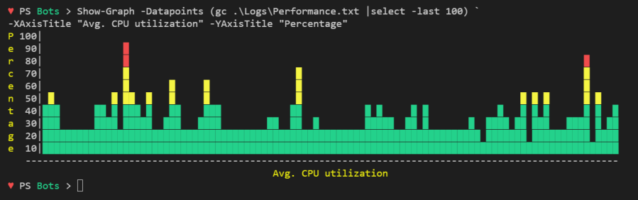
- The function consumes data points, generated during script execution or Pre-stored data like from a file or database.
Following is the full script and here is the link to the Github Project, please feel free to contribute as I still see some possibilities of improvement.
This file contains bidirectional Unicode text that may be interpreted or compiled differently than what appears below. To review, open the file in an editor that reveals hidden Unicode characters.
Learn more about bidirectional Unicode characters
| <# | |
| .SYNOPSIS | |
| Draws graph in the Powershell console | |
| .DESCRIPTION | |
| Consumes datapoints and draws colored coded fully customizable graph in the Powershell console. | |
| .PARAMETER Datapoints | |
| Array of data points which is to be plotted on the graph | |
| .PARAMETER XAxisTitle | |
| Label on the X-Axis | |
| .PARAMETER YAxisTitle | |
| Label on the Y-Axis | |
| .EXAMPLE | |
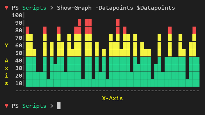
| Show-Graph -Datapoints $Datapoints | |
| .EXAMPLE | |
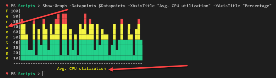
| Show-Graph -Datapoints $Datapoints -XAxisTitle "Avg. CPU utilization" -YAxisTitle "Percentage" | |
| .NOTES | |
| Blog: https://geekeefy.wordpress.com/ | |
| Author: https://twitter.com/SinghPrateik | |
| Features and Benefits: | |
| * Color-coded output depending upon the Value of Datapoint | |
| * Custom X an Y-Axis labels | |
| * Graph in console is independent and fully customizable, not like Task Manager (Performance Tab) | |
| * Could be incorporated in Powershell scripts | |
| * Can consume datapoints generated during script run or Pre stored data like in a file or database. | |
| #> | |
| Function Show-Graph { | |
| [cmdletbinding()] | |
| [alias("Graph")] | |
| Param( | |
| # Parameter help description | |
| [Parameter(Mandatory=$true)] | |
| [int[]] $Datapoints, | |
| [String] $XAxisTitle = 'X-Axis', | |
| [String] $YAxisTitle = 'Y Axis' | |
| ) | |
| $NumOfDatapoints = $Datapoints.Count | |
| $NumOfLabelsOnYAxis = 10 | |
| $XAxis = " "+"-"*($NumOfDatapoints+3) | |
| $YAxisTitleAlphabetCounter = 0 | |
| $YAxisTitleStartIdx = 1 | |
| $YAxisTitleEndIdx = $YAxisTitleStartIdx + $YAxisTitle.Length -1 | |
| If($YAxisTitle.Length -gt $NumOfLabelsOnYAxis){ | |
| Write-Warning "No. Alphabets in YAxisTitle [$($YAxisTitle.Length)] can't be greator than no. of Labels on Y-Axis [$NumOfLabelsOnYAxis]" | |
| Write-Warning "YAxisTitle will be cropped" | |
| } | |
| If($XAxisTitle.Length -gt $XAxis.length-3){ | |
| $XAxisLabel = " "+$XAxisTitle | |
| }else{ | |
| $XAxisLabel = " "+(" "*(($XAxis.Length – $XAxisTitle.Length)/2))+$XAxisTitle | |
| } | |
| # Create a 2D Array to save datapoints in a 2D format | |
| $Array = New-Object 'object[,]' ($NumOfLabelsOnYAxis+1),$NumOfDatapoints | |
| $Count = 0 | |
| $Datapoints | ForEach-Object { | |
| $r = [Math]::Floor($_/10) | |
| $Array[$r,$Count] = [char] 9608 | |
| 1..$R | ForEach-Object {$Array[$_,$Count] = [char] 9608} | |
| $Count++ | |
| } | |
| # Draw graph | |
| For($i=10;$i -gt 0;$i–){ | |
| $Row = '' | |
| For($j=0;$j -lt $NumOfDatapoints;$j++){ | |
| $Cell = $Array[$i,$j] | |
| $String = If([String]::IsNullOrWhiteSpace($Cell)){' '}else{$Cell} | |
| $Row = [string]::Concat($Row,$String) | |
| } | |
| $YAxisLabel = $i*10 | |
| # Condition to fix the spacing issue of a 3 digit vs 2 digit number [like 100 vs 90] on the Y-Axis | |
| If("$YAxisLabel".length -lt 3){$YAxisLabel = (" "*(3-("$YAxisLabel".length)))+$YAxisLabel} | |
| If($i -in $YAxisTitleStartIdx..$YAxisTitleEndIdx){ | |
| $YAxisLabelAlphabet = $YAxisTitle[$YAxisTitleAlphabetCounter]+" " | |
| $YAxisTitleAlphabetCounter++ | |
| } | |
| else { | |
| $YAxisLabelAlphabet = ' ' | |
| } | |
| # To color the graph depending upon the datapoint value | |
| If ($i -gt 7) {Write-Host $YAxisLabelAlphabet -ForegroundColor DarkYellow -NoNewline ;Write-Host "$YAxisLabel|" -NoNewline; Write-Host $Row -ForegroundColor Red} | |
| elseif ($i -le 7 -and $i -gt 4) {Write-Host $YAxisLabelAlphabet -ForegroundColor DarkYellow -NoNewline ;Write-Host "$YAxisLabel|" -NoNewline; Write-Host $Row -ForegroundColor Yellow} | |
| elseif($i -le 4 -and $i -ge 1) {Write-Host $YAxisLabelAlphabet -ForegroundColor DarkYellow -NoNewline ;Write-Host "$YAxisLabel|" -NoNewline; Write-Host $Row -ForegroundColor Green} | |
| else {Write-Host "$YAxisLabel|"} | |
| } | |
| $XAxis # Prints X-Axis horizontal line | |
| Write-Host $XAxisLabel -ForegroundColor DarkYellow # Prints XAxisTitle | |
| } | |
| #$Datapoints = (1..100|Get-Random -Count 50) | |
| #Show-Graph -Datapoints $Datapoints -XAxisTitle "Avg. CPU utilization" -YAxisTitle "Percentage" |
Hope you’ll find the script useful and Thanks for reading.
Please do follow me on twitter for more Interesting PowerShell material and don’t forget to Showoff your Powershell console graph to your colleagues, Cheers! 😉
![]()

This is brilliant !
LikeLiked by 1 person
Thanks Graham.
LikeLike
[…] on September 3, 2017 submitted by /u/Prateeksingh1590 [link] [comments] Leave a […]
LikeLike
Hi all, here every person is sharing these familiarity,
so it’s good to read this website, and I used to pay a quick visit this web site daily.
LikeLike
Everything is very open with a precise explanation of the
issues. It was truly informative. Your website is very helpful.
Many thanks for sharing!
LikeLike
Great Script, but It just display normal in my ISE console, can’t correct display in my powershell console,
What is the default setting value for the console size??
LikeLiked by 2 people
There is no default value defined yet, but I’m working on a next version that should fix some of these issues – https://github.com/PrateekKumarSingh/PSConsoleGraph/projects/1
LikeLike
Good news, is it possible to add more types of graph(just like pie chart, bar chart, scatter…etc) at the future version? it will get more convenience for data analysis.
LikeLike
Definitely, I’ve been thinking in same lines. lets see how it goes- bar and scatter charts are possible, but in console its bit tricky to make a pie chart, but that doesn’t means it is not possible. Moreover WinForms could be used to make something like Python’s – ‘MatPlotLib’ in Powershell, which is my ultimate goal. Future has amazing possibilities 😉
LikeLike
[…] outputs a 2D graph. It is mainly a stripped-down version of Show-Graph made by Prateek Singh. He made a wicked nice script that takes an array of integers as input. It […]
LikeLike
Would you tell me how to export the chart to excel files? (so that I can let it automatically show in DevOps dashboard.)
LikeLike